

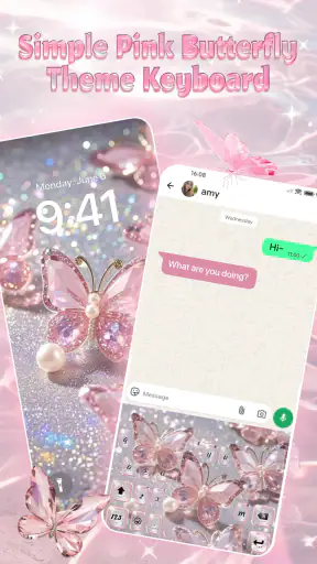
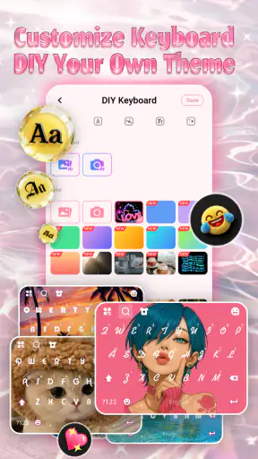
Simple Pink Butterfly Theme is the kind of personalization app that makes an immediate impression. I installed it expecting a narrow visual change, but the appeal is broader: it gives the keyboard a coordinated pink butterfly look, with custom fonts, emoji styling, and a glass-like visual direction aimed at aesthetic typing. The result is playful rather than practical, and that distinction matters. This is not an app I would recommend to someone searching for a faster keyboard or a serious productivity tool. I would recommend it to someone who wants everyday typing to feel more personal.
What makes the app interesting is how often a keyboard appears during the day. A wallpaper can disappear behind another window, while the keyboard comes back whenever I answer a message, search for something, write a note, or enter a password. That repeated exposure gives a small theme more staying power than its simple presentation might suggest. At the same time, repeated exposure can also make a strong visual style feel tiring. My experience with this app is therefore less about whether the butterfly design looks attractive at first sight and more about whether it remains comfortable after the novelty has worn off.
From the first setup to everyday typing
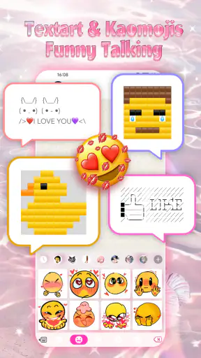
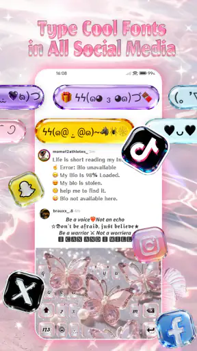
The first-week appeal is easy to understand. The pink butterfly identity is clear, and the glass effect gives the keyboard a softer, decorative feel than a standard system layout. The included focus on fonts and emoji adds variety around the central theme, so the experience is not limited to changing one background image. I found the concept especially suitable for people who already coordinate their phone around a favorite color, a cute visual style, or a more expressive home screen.
The app is listed in the personalization category and is free to use. That makes it an uncomplicated experiment: I can try the look without treating it as a major purchase or a permanent commitment. The developer is Custom Themes for Android Apps, and the current version is 1.0.8.0807. It supports Android 7.0 and later, which gives it a broad practical reach for people using older phones as well as newer devices.
During the first few days, the most enjoyable part was seeing the design appear in ordinary situations rather than only in a preview. A short reply in a chat, a search query, and a note to myself all became small opportunities to use the theme. This is a useful strength of keyboard personalization: it follows the writing habit instead of asking me to open a separate app just to see the design.
A realistic example is a busy morning when I am replying to several messages before leaving home. I am not thinking about customization in a deliberate way, but the pink butterfly keyboard is present each time I type. That creates a sense of continuity across otherwise unrelated tasks. For a teenager or anyone who enjoys a highly styled phone, this kind of repeated detail can make the device feel more like their own.
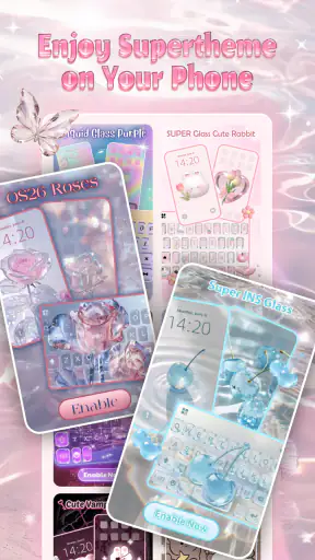
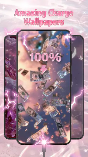
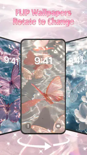
There is also a practical question new users often have: will the theme change the whole phone? I would approach it as a keyboard-centered personalization experience, not as a complete system makeover. The visual impact is strongest where the keyboard appears. If someone wants matching icons, menus, lock-screen elements, and system controls, a broader launcher or theme solution would be a better fit.
The same distinction applies to typing performance. I would not choose this app expecting a new writing engine, advanced correction, or a major improvement in speed. Its reason to exist is visual expression. People who already like their current keyboard and only want to make typing look different should understand that the benefit is cosmetic and emotional, not a promise of better text entry.
The app carries a Teen content rating, which is consistent with a colorful personalization product intended for a general mobile audience with some age guidance. It has reached over a million installs and holds a 4.7 average from around ten thousand ratings, so the concept clearly connects with a substantial group of users. Those figures suggest strong first impressions, although they do not guarantee that every user will enjoy living with the design for months.
What makes the style work
The strongest design choice is the combination of a recognizable object and a restrained material idea. Butterflies provide the decorative personality, while the glass pink treatment keeps the keyboard from feeling like a random collection of stickers. When those two elements are balanced, the keyboard looks themed without becoming visually chaotic.
Fonts and emoji are important because they let the user reinforce the mood in different ways. A font can make the keyboard feel softer or more playful, while emoji help express the same tone in messages. I see this as a useful workflow: choose the butterfly theme as the base, then use font and emoji choices selectively instead of changing everything at once. That approach reduces the risk of creating a design that looks exciting in a preview but becomes difficult to live with.
One non-obvious trade-off is that decorative keyboards compete with visual clarity. On a bright screen, pink and glass effects may look attractive but can make key boundaries less immediate, especially when I am typing quickly or in a dim environment. I would spend a little time checking whether the letters remain easy to distinguish before deciding that the theme is a permanent choice. A design that looks beautiful in screenshots may not be the most comfortable during fast, one-handed writing.
Another useful test is to use the keyboard for different kinds of text. Short messages are forgiving because I can glance at the screen and correct mistakes. Longer notes, school assignments, or work-related replies expose any visual distraction much more quickly. I would test those situations during the first week rather than judging the app only from casual chats.
Does it keep earning its place after the novelty?
The month-to-month value depends almost entirely on the user’s relationship with customization. If I enjoy refreshing the look of my phone and regard the keyboard as part of that routine, the app can remain worthwhile. It gives a repeated visual detail to a tool I already use constantly, and that can be more satisfying than a theme applied to a rarely opened screen.
If I prefer a neutral interface, the value drops quickly. A butterfly keyboard may feel charming for a few days and then become background noise. That is not a flaw unique to this product; it is the central challenge of decorative personalization. The design has to be pleasant enough to repeat without demanding attention every time I type.
I found that the best long-term use case is not trying to make every part of the phone equally decorative. Keeping the rest of the interface relatively calm allows the keyboard to act as an accent. This is a concrete way to reduce fatigue: use the theme as a small signature rather than surrounding it with several competing pink or butterfly elements.
There is also a social dimension. Someone who frequently sends messages may enjoy having a keyboard that reflects their personality, even though recipients do not necessarily see the keyboard itself. The benefit is still real because the user sees it during composition. For people who treat their phone as a personal accessory, that private sense of style can justify keeping the app installed.
On the other hand, users who switch between several keyboards for different languages, accessibility needs, or specialized typing tasks may find the theme less convenient as a daily default. In that situation, a visual keyboard app has to fit around an existing workflow rather than replace it. I would keep expectations modest and decide whether the look is worth the extra switching.
Maintenance, switching, and everyday friction
The maintenance burden appears light in concept, but keyboard customization always deserves a careful look in daily use. The main task is not constant adjustment; it is deciding whether the selected appearance continues to suit the way I type. If I change fonts or emoji styles too often, the experience can become another small customization chore instead of a relaxing improvement.
My preferred routine would be to choose one readable font, keep the butterfly design as the visual anchor, and avoid changing the appearance every time I get bored. That creates a stable habit and makes it easier to judge the theme fairly. If I am still distracted after several days of normal typing, changing tiny details probably will not solve the underlying issue.
A second maintenance concern is consistency. The keyboard may look polished in one messaging app and less central in another interface, simply because different apps frame the typing area differently. I would evaluate it across messaging, search, notes, and forms rather than assuming that one attractive preview represents every situation. This is especially important for anyone who spends a lot of time typing outside social apps.
People also ask whether a themed keyboard is suitable for sensitive text. My advice is practical: use the keyboard only if you are comfortable with it in the same situations where you would use any third-party typing tool, and keep a familiar alternative available if needed. For passwords, banking, or work information, I prefer having the option to return to the keyboard I already trust. That is not a criticism of this particular design; it is sensible behavior whenever a personalization app becomes part of text entry.
The Android requirement is another point in its favor for households with mixed devices. Support beginning with Android 7.0 means the app is not limited to the newest phones. Still, the visual result can vary with screen size, display settings, and the surrounding keyboard layout. A small phone may make decorative details feel crowded, while a larger display may give the glass effect more room to breathe.
Because the app is free, the decision is easier for casual users. I can try it, use it for a normal week, and remove it if it does not become part of my routine. The sensible approach is not to install it solely because the preview looks attractive, but to test whether it remains readable during longer sessions and whether switching back and forth is acceptable.
Where visual fatigue begins
The main source of fatigue is the strength of the theme itself. Pink butterfly imagery has a clear personality, which is exactly why it appeals to its target audience, but that personality leaves less room for neutrality. I would not call it versatile in the same way as a simple dark, light, or monochrome keyboard. It is designed to be noticed.
That can become inconvenient when the mood of the day changes. A playful design may feel perfect during casual conversations but less appropriate when writing a formal message or completing a serious task. Since the keyboard appears in every context, the user may eventually want a quieter option. This is where a standard system keyboard or a restrained personalization tool has the advantage.
Readability is the second possible weakness. Fonts and glass effects should support the letters, not compete with them. I would avoid choosing the most decorative font simply because it looks distinctive. A slightly calmer option is more likely to survive regular use, especially for people who type quickly or rely on visual scanning rather than looking at each key individually.
There is also the risk of confusing novelty with usefulness. The first look can create a strong emotional response, but a lasting app needs to improve the feel of a repeated habit. In this case, the improvement is a sense of identity and enjoyment, not efficiency. Users who expect fewer mistakes, smarter suggestions, or a more professional writing environment may be disappointed if they judge it by the wrong standard.
For that reason, I would skip it if my priority is maximum typing speed, a minimal interface, accessibility-focused contrast, or a keyboard built around advanced writing tools. The usual system keyboard is the safer choice for reliability and familiarity. A full launcher or device-wide theme is better for someone who wants the entire phone to share one visual language. Simple Pink Butterfly Theme makes more sense for the narrower, more personal goal of making the typing surface feel cute and distinctive.
Who will enjoy it over time?
I think the best audience is someone who sees customization as part of phone ownership rather than a one-time decoration. The app is particularly appealing to users who like pink aesthetics, butterfly motifs, expressive emoji, and a keyboard that feels noticeably different from the default. It also suits people who want a free way to experiment before committing to a larger personalization setup.
It is less suitable for someone who wants a professional, understated appearance in every context. It may also be a poor match for heavy writers who spend hours in long documents and need the clearest possible key separation. In those cases, a plain keyboard can be more comfortable even if it looks less exciting.
One of my practical recommendations is to treat the first week as a trial period with specific checkpoints. Use it for quick messages, a longer note, and a task where accuracy matters. Notice whether the font remains readable, whether the pink glass treatment distracts you, and whether you miss the familiar feel of your previous keyboard. These observations tell you more than a short preview ever could.
If the theme still feels pleasant after those tests, it has a reasonable chance of earning lasting space. The recurring value is not hidden productivity; it is the small pleasure of seeing a personal design during an ordinary habit. That can be enough, provided the appearance remains comfortable and does not interfere with the way you write.
My long-term verdict
My recommendation is positive, but deliberately specific: Simple Pink Butterfly Theme is worth trying for anyone who wants a free, expressive keyboard look rather than a new typing system. Its pink butterfly styling, font options, emoji focus, and glass-inspired presentation give everyday messages a recognizable personality. The app’s strong reception, with a 4.7 average and more than a million installs, supports the idea that this visual approach has broad appeal.
After the novelty fades, its staying power comes from repetition. A keyboard is visible during countless small tasks, so a design that genuinely matches my taste can remain rewarding without requiring regular attention. The key is moderation: choose readability over the most elaborate look, test it beyond short messages, and keep a familiar alternative for situations where a neutral keyboard is more appropriate.
I would not describe it as an all-purpose personalization solution, and I would not install it expecting better writing performance. Its value is narrower and more honest than that. It turns an ordinary part of the phone into a personal accent. For the right user, that is enough to make it a keeper; for everyone else, the same strong visual identity may be the reason to move on after the first week.
Released on February 5, 2026, and carrying a Teen rating, it is a focused choice for Android users who want their typing space to reflect a playful aesthetic. I would give it a fair trial, judge it by comfort rather than screenshots, and keep it only if the butterfly style still feels enjoyable during routine writing. That is the real test of this app: not whether it looks appealing once, but whether it continues to make a familiar habit feel pleasantly personal.


